Critique 004
Lumen Bank and the word 'basically'
A pastel blob, a lowercase sentence, and one adverb doing all the legal work in the room.
- Brand
- Lumen Bank
- Medium
- Digital
- Year
- 2025
- Grade
- C
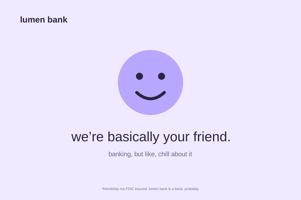
Lumen's display ad is a soft purple field, a smiling round character, and a lowercase line: "we're basically your friend." Underneath, smaller: "banking, but like, chill about it."
The execution is fine. The purple is pleasant, the type is set well, the character is drawn with some charm. This review is about why fine is a problem.
The adverb
"Basically" is the most interesting word on the page, because it is the word that survived legal review. "We're your friend" is a claim a bank cannot make, so the sentence hedges, and in hedging it says something accidentally true: this is friendship approximated by an institution that also charges fees.
Read at face value, the line is a small act of honesty. Read at the speed people read display ads, it is the sound of a brand being likeable at you.
Sameness as a strategy
The larger issue is that this ad is not Lumen's. Replace the wordmark with any of six competitors and the layout, the palette, the lowercase register, and the blob all continue to work. When an ad can be reassigned without adjustment, it has not established anything about the advertiser; it has paid to reinforce a category convention.
A friendly tone is not a differentiator when the entire category is being friendly in the same font.
The footnote
The one flash of genuine voice is the small print: "friendship not FDIC insured. lumen bank is a bank. probably." It is funny, it is self-aware, and it suggests there is a writer on this account with a sharper idea of who Lumen might be. That idea is not in the ad.
The grade
C is not a punishment. It is what competent, well-produced work earns when it declines to make a choice. Nothing here is wrong. Nothing here is Lumen's either.
fintechdigitalbrand voice