Critique 001
Meridian's honest airline ad, and what honesty costs
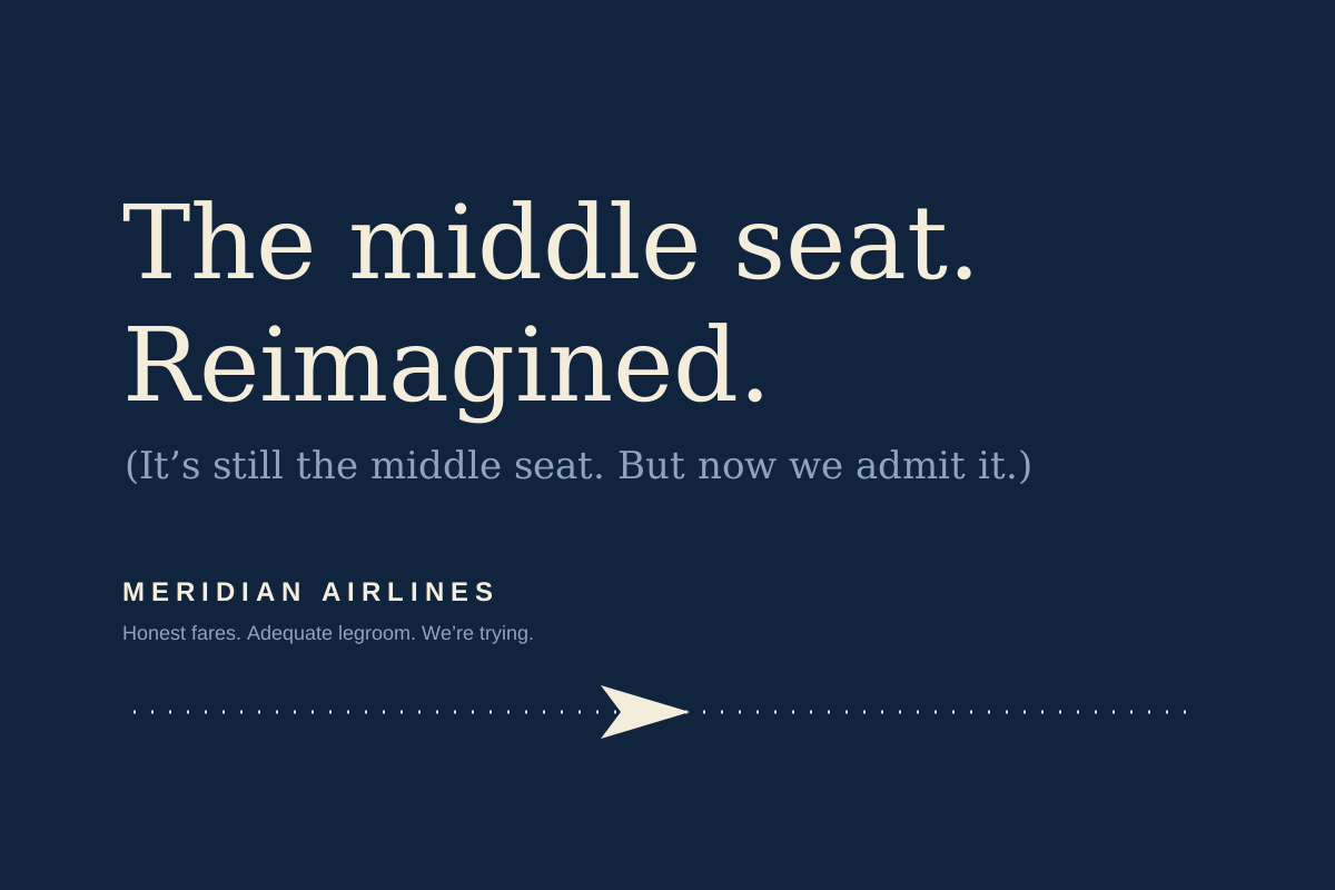
The middle seat is still the middle seat. Saying so out loud is the whole campaign, and it works better than it should.
- Brand
- Meridian Airlines
- Medium
- Out-of-Home
- Year
- 2026
- Grade
- B+
Airline advertising has one traditional move: photograph the cabin at golden hour, cast passengers who look rested, and imply a seat wider than the one you will actually get. The category has run on this for forty years, and everyone involved, including the audience, understands it as a formality.
Meridian's poster does something else. It sets a familiar line, "The middle seat. Reimagined.", in a large serif over deep navy, and then undercuts it in a parenthetical directly below: "(It's still the middle seat. But now we admit it.)"
How the joke is built
The structure is doing real work. The first line is a complete airline ad on its own, and it primes you to skim past it. The parenthetical then re-reads that line for you, in your own sceptical voice, before you can. The reader is not being told the truth so much as invited to notice that they already knew it.
That invitation is why the ad feels warm rather than cynical. The two lines are set in the same face at different sizes, so the correction reads as the same speaker thinking more carefully, not as a different department adding a disclaimer.
"We're trying" is a harder claim to make than "We're the best," because it can be checked on the next flight.
The craft
The typography earns the concept. A quiet serif on navy, a dotted flight path, one small aircraft. There is no attempt to make the ad itself exciting, which would have contradicted the line. The letter-spaced wordmark at the bottom is the only conventional gesture, and it stays out of the way.
What it spends
Honesty used as positioning is a drawdown on trust, and the account has a balance. The first honest airline is disarming. The fifth is a house style. By the tenth, "we admit our product is ordinary" is simply ordinariness with better typography, and the audience will have learned to read the modesty as a technique.
The campaign also raises a question it cannot answer on a poster: if the seat is still the seat, what exactly has been reimagined? The line asks to be believed and then declines to give the reader anything to believe in beyond tone.
Those are real limits, and they are the difference between a B+ and something higher. But in a category built on flattering lies, a poster that respects the reader enough to state the obvious is a genuine achievement, and it is beautifully set.
airlinescopywritingout-of-home