Critique 005
Verda's minimalism says nothing, beautifully
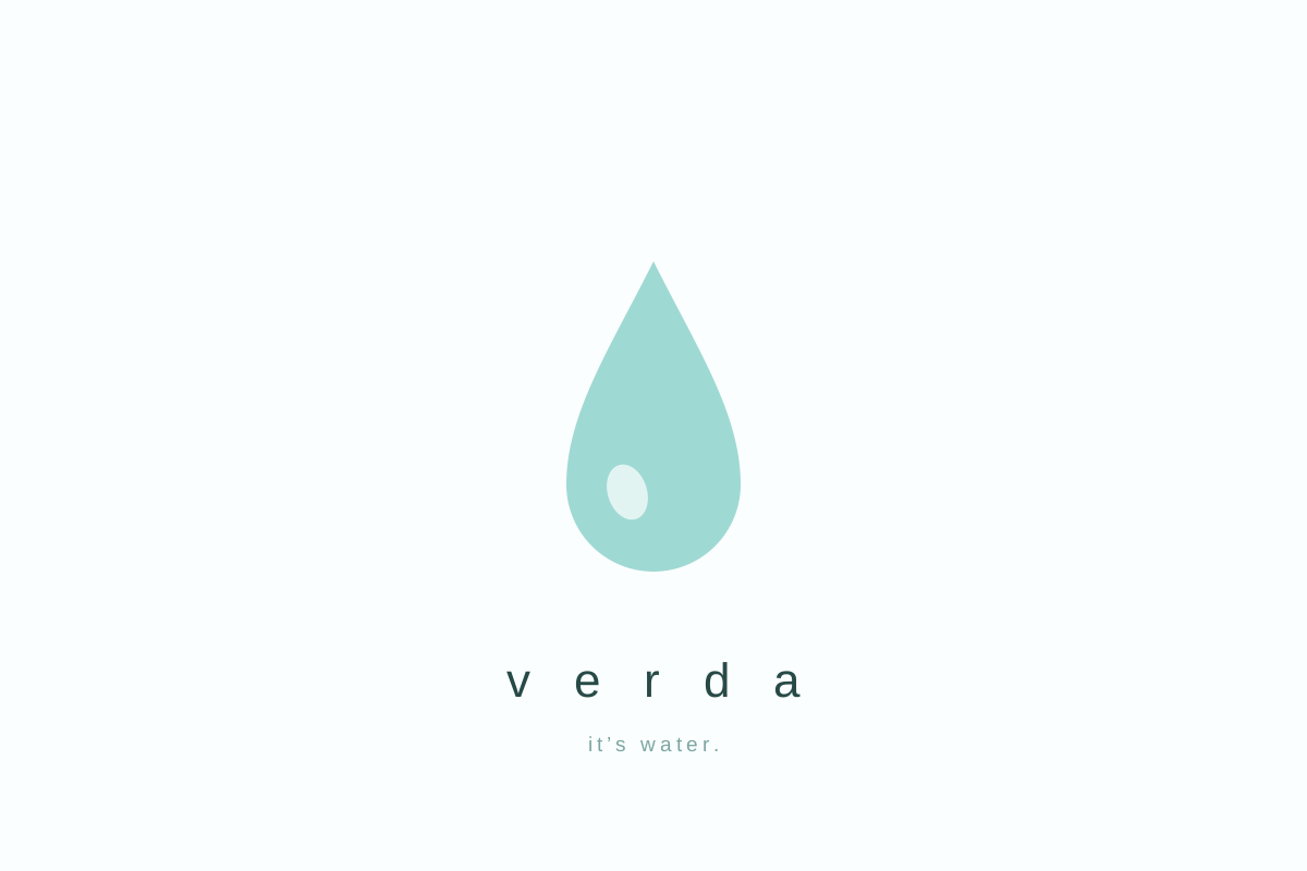
One droplet, an ocean of whitespace, and a deadpan line that is doing less work than it appears to.
- Brand
- Verda
- Medium
- Year
- 2026
- Grade
- B-
Bottled water is the purest test in advertising, because the product is identical by definition. Every brand sells the same molecule, so the advertising is not describing a difference; it is the entire difference. That makes Verda's page genuinely interesting: it spends a premium position to say "it's water."
What lands
The deadpan is well judged. After decades of glacial origin stories, mineral mysticism, and springs photographed as though nobody else had ever found them, a page that declines to make a claim reads as a company exhaling. The droplet is drawn with real care, with a single highlight placed slightly off centre so it reads as volume rather than as a shape. The letter-spaced lowercase wordmark floats at exactly the weight the joke needs.
What does not
Honesty is doing the same job here that "basically" does for Lumen Bank: it is a costume. The difference between this page and GLOWBOY's is that GLOWBOY's restraint tells you something true about the product, while Verda's tells you the brand has seen the same three anti-ads everyone else has seen.
Minimalism is confidence until it is a shrug, and the line between them is about forty per cent of this layout. The page is minimal because minimal tested well; you can faintly hear the testing.
Saying "it's water" is only a brave line if the alternative was a lie you were tempted to tell.
The economics
At these rates, that much whitespace is a media decision, not a design one, and it should be earning something. What it earns here is a moment of recognition and no reason to reach for this bottle over the identical bottle beside it.
Pleasant, well made, self-aware, and forgotten by Thursday. The page says as much.
bottled waterprintminimalism